This blog post goes into detail on making my gift tags. Both large and small, they all made from original paintings. If you are giving one of my paintings as a gift I think it adds another special, personal touch.
Sometimes they may be waste from an A6 painting that has been cut into a 100 x 100 mm painting for a 150 x 150 mm cards (you might like to read my blog post about turning sketches into cards. Or they may be cut up from paintings or sketches that I have done whilst out and about. I do love to sketch when I am out for a walk (as shown in my post sketches during 2024). I do enjoy doing these little sketches but I don’t feel they cut the mustard on their own as a card, but I can’t bear not to do something with them. This was my inspiration to make small and large gift tags from them.
Two sizes of Gift Tags
I have two sizes, the small ones. these are two layers which are separated so a message can be added. Or a larger tag, with layers all glued together with space on the reverse for a message.
Click on the image to see it larger.


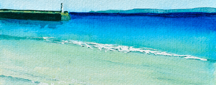
Tregirls Gift Tags
Here is an example of gift tags made from the sketch I did at Tregirls, that I cut into 3 to make tags.
Click on the image to see it larger.


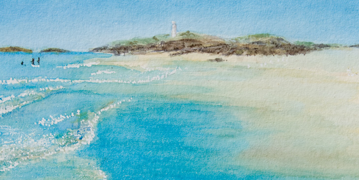
Penzance Gift Tags
In this example, the original painting was of Penzance waterfront, as seen from Marazion. From this painting I was able to cut it into 3 larger images and one small image. I also had spare room in the painting to cut out reinforced rings using the same paint colours.


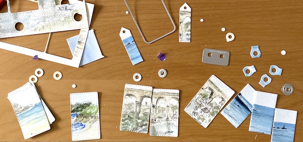
Making Gift Tags Process
When looking at the painting I check to see how best to die cut the painting, to create a nice tag. Sometimes I also die cut a reinforcement ring from the painting as well. The next step is to colour match the background layers with the paintings, this is always fun and can be easier than others!


I often paint using an A6 watercolour pad and my cards are 6 x 6 there tends to be waste. Or rather small offcuts from my painting that I am not using. These can be turned into a range of gift tags, usually the smaller tags. These tags have just the one layer beneath them, to frame the little painting. Finally the base layer needs to be cut. Then they just need to be assembled with string to keep them together.


I have previously sold my gift tags at St Just Craft Fair, The Mining Exchange and The Craft Collective shop in Redruth. However like my cards, as they are all originals, once they are gone, they are gone!

At the time of writing this blog post my gift tags are not available to buy online, but if you are purchasing one of my larger paintings and would like a gift tag to match, please get in touch and I will see what I can do for you.