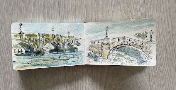
On a recent visit to Twickenham Stadium to see the Red Roses Rugby match I managed a couple of sketches of Richmond Bridges.
Click on any of the images to see a larger version.
My Sketches
My first attempt turned out quite difficult. We had visited Richmond on a sunny Sunday morning and decided to stop on the Peggy Jean at Riverside Green, Richmond. I got my paints out. However then it decided to rain and umbrellas went up. We had to move seats and then carried on painting despite the heavy rain. It was a very quick sketch, and then of course the sun came out. But the seats were very wet.
I was staying in Isleworth and decided to explore near along the river. It follows the Thames Footpath and I found a lovely spot overlooking the Richmond Lock and Footbridge. If you ignore the sound of the planes overhead, it is an incredibly peaceful spot. This time I managed to dodge the rain to do a quick sketch.
Red Roses Rugby Match
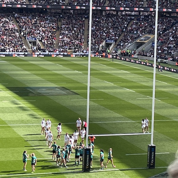
As mentioned above the main event was to see the Red Roses at Twickenham Stadium. Whilst I didn’t do any sketches on this occasion I thought you might like to see some photos. They were playing Ireland at the start of the Women’s Six Nations Series. Twickenham Stadium was nearly full and it was a great atmosphere. During the half time interval they had a sing along, not everyone’s taste but it added to the fun. Whilst Ireland put up a good fight the Red Roses did win 33 – 12 and an enjoyable game of Rugby.
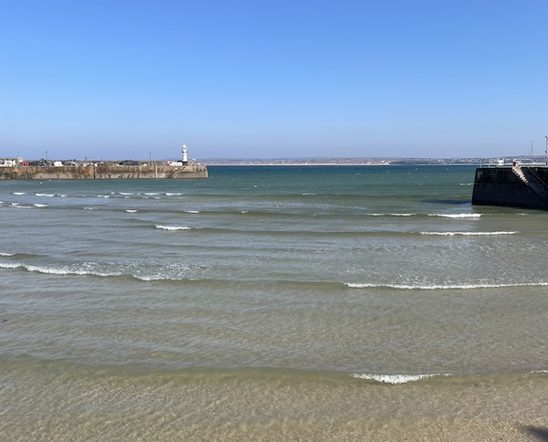
I had a lovely trip to St Ives the other day and, of course, I did a sketch of Porthminster Beach.
It was a lovely March day, the sun was shining, the tourist season hadn’t begun, so a good day to visit St Ives. I went with my husband on the train, so much easier. I do of course love the view from the train, nearly the best train ride in the world! However I accept I am biased.
Coffee overlooking Porthminster Beach
We stopped at the newly refurbished Peda Olva Hotel to sit outside and enjoy a coffee. It was glorious and time to get my paints out. It was low tide and the train was coming and going whilst we sat there. Another couple were sat enjoying a coffee and she was a little concerned she might be put in my painting. I assured her I was painting beach and hadn’t included anyone.
We had a lovely walk around St Ives, which was actually busier than anticipated. Given we have had a very wet winter, it wasn’t totally surprising that other locals were making the most of the weather.
Beer and Lunch
We stopped for a refreshing Beer at the Bier Hus Grand Café. Since visiting Belgium a few years back we have developed a taste for Belgium beer, and the Bier Hus has the best selection. This time we transported ourselves back to Bruges via a Zot. Very tasty. However it is inside so I didn’t do any sketching her.
We then had a spot of lunch at the Talay Thai Kitchen. If you like Thai food I can highly recommend. We had a great view overlooking the harbour and our food came out before I had a chance to get my paints out. After a delicious Pad See Ewe we sat and watched the antics of the seagulls!
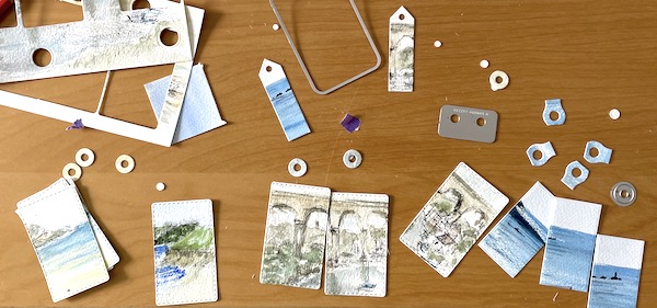
This blog post goes into detail on making my gift tags. Both large and small, they all made from original paintings. If you are giving one of my paintings as a gift I think it adds another special, personal touch.
Sometimes they may be waste from an A6 painting that has been cut into a 100 x 100 mm painting for a 150 x 150 mm cards (you might like to read my blog post about turning sketches into cards. Or they may be cut up from paintings or sketches that I have done whilst out and about. I do love to sketch when I am out for a walk (as shown in my post sketches during 2024). I do enjoy doing these little sketches but I don’t feel they cut the mustard on their own as a card, but I can’t bear not to do something with them. This was my inspiration to make small and large gift tags from them.
Two sizes of Gift Tags
I have two sizes, the small ones. these are two layers which are separated so a message can be added. Or a larger tag, with layers all glued together with space on the reverse for a message.
Click on the image to see it larger.
Tregirls Gift Tags
Here is an example of gift tags made from the sketch I did at Tregirls, that I cut into 3 to make tags.
Click on the image to see it larger.
Penzance Gift Tags
In this example, the original painting was of Penzance waterfront, as seen from Marazion. From this painting I was able to cut it into 3 larger images and one small image. I also had spare room in the painting to cut out reinforced rings using the same paint colours.
Making Gift Tags Process
When looking at the painting I check to see how best to die cut the painting, to create a nice tag. Sometimes I also die cut a reinforcement ring from the painting as well. The next step is to colour match the background layers with the paintings, this is always fun and can be easier than others!
I often paint using an A6 watercolour pad and my cards are 6 x 6 there tends to be waste. Or rather small offcuts from my painting that I am not using. These can be turned into a range of gift tags, usually the smaller tags. These tags have just the one layer beneath them, to frame the little painting. Finally the base layer needs to be cut. Then they just need to be assembled with string to keep them together.
I have previously sold my gift tags at St Just Craft Fair, The Mining Exchange and The Craft Collective shop in Redruth. However like my cards, as they are all originals, once they are gone, they are gone!
At the time of writing this blog post my gift tags are not available to buy online, but if you are purchasing one of my larger paintings and would like a gift tag to match, please get in touch and I will see what I can do for you.
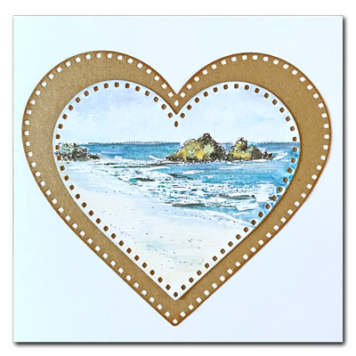
I have added some new locations for my 2026 Valentine’s Cards. I normally focus on locations within Cornwall, however this year I am including Greek Islands and The Caribbean! My Valentine’s Cards always sell out on Etsy and I am hoping these new locations will prove to be just as popular. I should stress I am still including Cornwall 2026 Valentine’s Cards.
Of course they don’t have to be Valentine’s Cards, they could be for any occasion where you might want a heart shaped card. My paintings sit inside a heart aperture of a 6 x 6 inch blank greeting card.
I have only visited Greece once, and that was to Crete. As it turns out it was quite a cloudy week but on the last day of our holiday the sun shone and the beach was packed. We later researched visiting Corfu. Corfu, similar to Cornwall, has different kinds of beaches. Some are tiny inlets with pine covered mountains surrounding them, others are more open with long stretches of sand. That the inspiration for my painting, which is now available as card.
I visited Venice on a day trip from Garda back in 2012. It was an extremely hot day and sadly I couldn’t find anywhere to sit and sketch. I remedied that on my return and I painted this scene. I have painted a larger version of this scene, which has sold. However I do have a smaller version available, which I am including in my 2026 Valentine’s Card selection.
I definitely haven’t visited the Caribbean but this actually a larger painting of the Caribbean that I have cut in order to make two cards. One of the cards shows a boat alongside a deserted beach, with just beautiful white sand and palm trees. The other card features the island, together with the mainland in the distance. I must admit I would love to visit this island and I can imagine enjoying a lovely swim in that turquoise water.
I wrote a previous blog about this painting, that you might want to read.
All of these cards are original paintings and therefore are “one-offs”, so if one catches your eye I would recommend not delaying. Have a look on my Etsy shop to see what is currently available.
Also if you would like an actual sentiment included, then please get in contact and I will see if I can accommodate your request.
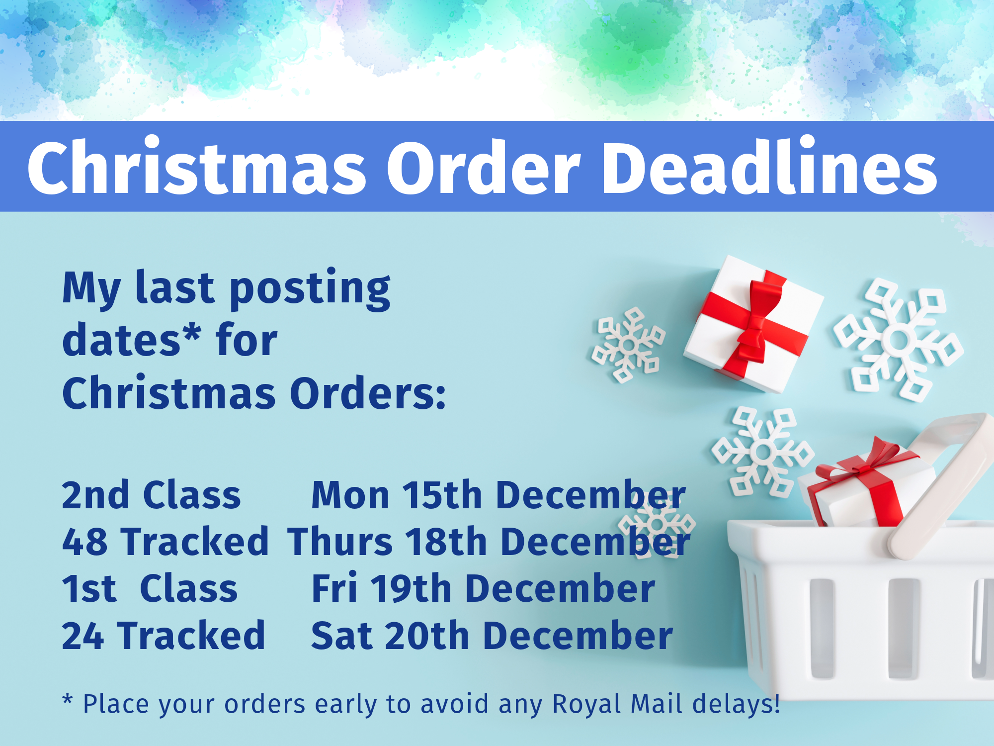
I always try to despatch my orders on the same day as delivery. With that in mind here are my last posting dates for Christmas
2nd Class
Mon 15th December
Tracked 48
Thurs 18th December
1st Class
Fri 19th December
Tracked 24
Sat 20th December
Avoid delays with Royal Mail deliveries
I recommend placing any orders early to allow for any Royal Mail delays!
I am talking from experience here because my birthday cards were 9 days late! This was quite a surprise because 4 of my cards were all posted first class. Two were from areas just 2 and 3 miles down the road from me. On reflection they agreed they should have got in the car and driven to deliver them. But you do expect a better service from The Royal Mail. The two other cards were from well known card resellers – Thortful and Funky Pigeon; and I am sure the have better processes than Royal Mail to ensure their cards are despatched on time!
It was similar for my husband’s birthday, cards posted first class took over a week to arrive. In fact first class and second class arrived on the same day. It does appear that the Royal Mail only deliver to us, sometimes once or twice a week, sometimes not at all.
Sorry, rant over! But I would hate for anyone to be disappointed in not receiving any last minute orders.
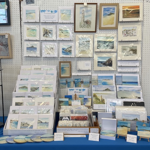
Here are some ideas of Christmas presents
Mini Easel Acrylic Paintings
The perfect little gift to give to remind someone of their special place in Cornwall. An original piece of art that doesn’t need fixing to a wall, it will sit on any surface. Priced at just £15 to include delivery. Visit my Acrylics page to see the full page.
I also have a wide range of watercolour paintings, from my 6 x 6 greeting cards (buy your own frame to make a cost effective gift) to much larger paintings. Here is a small selection but visit my Original Paintings page to visit the full range.
My latest blog post features sketches from the Lizard area, as well as Godrevy. Actually there is one from Praa Sands, which isn’t really the Lizard area – but it is West Cornwall. These have been from my travels during September and October 2025. Click on any of the pictures to see the larger version.
The Lizard
I visited The Lizard itself in early October. The weather forecast wasn’t great but it turned out to be a lot better than forecast. In fact the sun came out for a short while. I was out with my friends and we walked from The Lizard village down to the headland. We stopped at Polpeor cafe and looked across to Polpeor Cove. The Cafe is now in new hands but it was very nice, although the menu is not as extensive as it was previously.
Godrevy
Godrevy is always one of my favourite spots. I did a little sketch from the top field car park. It was looking very long distance so you can see Gwithian. I took a bit of artist license and decided not to include all the cars! That is the difference between a painting and a photograph. I can decide what to include or not. Although I do know that you can alter images in packages such as Photoshop. Or even worse, use AI!
Praa Sands
Again we hit it lucky with the weather. In fact for a little while it was glorious. Although whilst sat at the Stones Reef Bar we did need to run inside because of a short rain shower. The Stones Reef Bar is definitely one of my favourite spots.
Poldhu
It was absolutely glorious when we visited Poldhu. I was interested that The National Trust has taken over the car park. Being a National Trust member, this was very handy. It was low tide so we had a great walk on the beach. Then afterwards enjoyed a lovely cup of coffee at The Poldhu Cafe. What a great view. This time I tried to capture the whole beach.
I may well turn some of these paintings into cards and gift tags. Take a look at my Watercolour Painting Greeting Cards to see what is currently for sale. Don’t forget to click on any of the pictures to see the larger version.
My latest blog post is about sketching in West London. I recently went to West London to visit my daughter who lives up there. The weather was hot in fact too hot to be outside much so I have a mix of sketches! Some outside and some inside!
Here are my sketches – click on the image to see a larger version.
Sketching Outside
Old Isleworth
It was very hot when we arrived so I had to take refuge sitting out of a lovely pub along the Thames in Old Isleworth. The pub is called Town Wharf and has recently reopened. It had a lovely shady decking area over the Thames. Over the years we have usually to visited the pubs along The Strand, near Kew Bridge. However they can get very busy, especially on sunny days and, even worse, on a sunny day with temperatures over 30 degrees, there is limited shade! So finding this pub open was a real treat, although a little further upstream. It was a very peaceful, scenic spot so I had to get my paints out and capture the scene.
Battersea Power Station
After a few days It cooled down so I did venture out to Battersea Power Station. It was great to see this landmark building now restored into a food / shopping place to visit. I can remember when it was still in use from when I lived in London over 45 years ago. There are lovely landscaped gardens, and seating areas overlooking the Thames, a lovely place to chill. I did try and paint it, but to be honest it was big!
Sketching inside
To be honest I find it quite hard being in London during heatwave. Also we were visiting our daughter so we didn’t feel we had to get out exploring! We have visited London on many occasions.
So I decided to get my paints out to sketch some of my favourite scenes of Cornwall. No this wasn’t to remind me I could be at home enjoying a cooling swim – or perhaps it was! These have now been converted into my latest batch of 6 x 6 cards and will be for sale on my Etsy store.
The paintings were from photographs on my phone of Sennen Beach and Marazion. I also experimented with an abstract seascape, taking inspiration from a painting my daughter has on her wall.
It is August which means the St Just Art and Craft Fair is taking place. This annual Exhibition raises money for Cancer Research and features over 200 local Artists and Crafters. There is a wide range of items available to buy, certainly something for everyone.
The Art and Crafts Fair takes place at Cape Cornwall School in St Just. It runs from 4–15th August open from 10am–7pm daily. Except for the final day when it closes at 5pm.
Entrance fee is £1 for adults, and 50p for children. Refreshments are also available with home made cake!
I have a backboard this year, as well as a 4ft table so I had fun planning the layout! And even more fun setting up the stall!
With so many exhibitors it can be hard to get noticed and I felt the backboard would give people a quick glimpse of what I have to offer.
Watercolour paintings
I have an even larger range of paintings than last year.
6 x 6 Watercolour cards
As usual I have my 6 x 6 inch watercolour cards. I have painted scenes of St Michaels Mount and Song of the Sea, at Nanjizal, as are always popular. I also have a range of other scenes from all over West Cornwall.
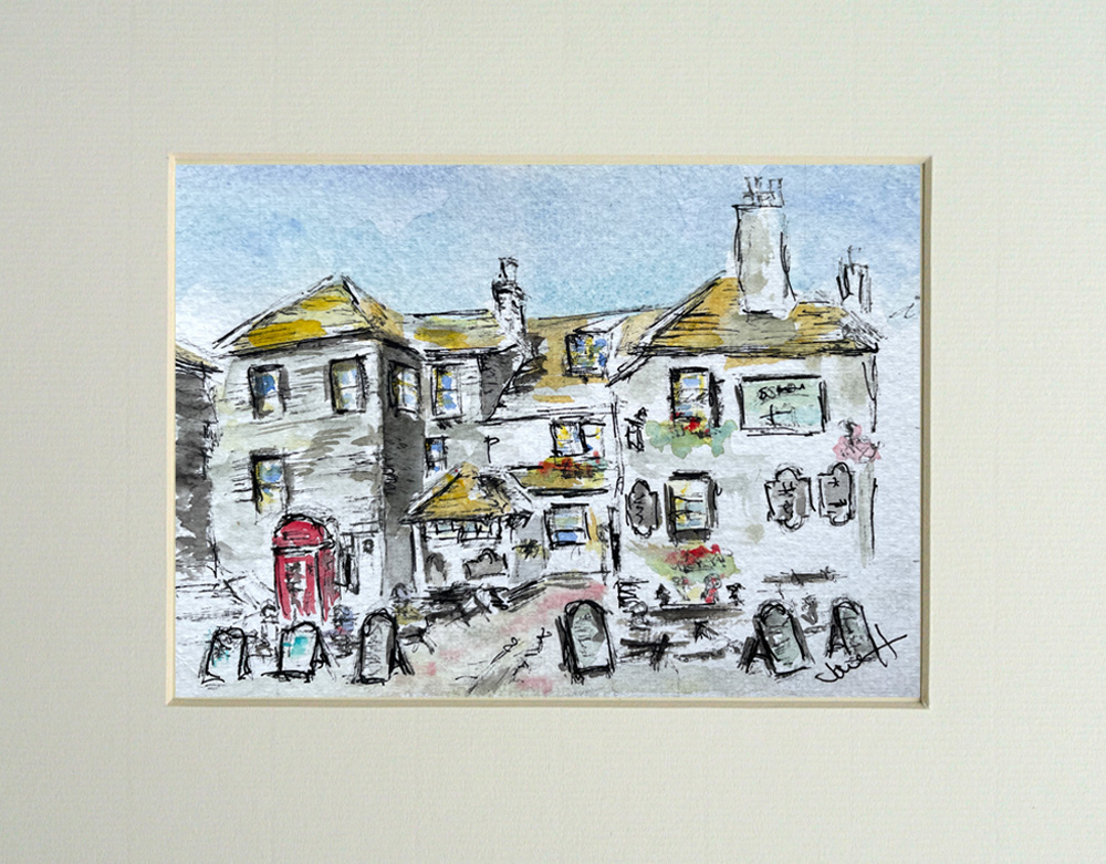
9 x 7 mounted paintings
Last year sadly I didn’t sell any of my mounted prints so I am reluctantly reducing the price. It is raising money for Cancer Research after all. If more sell then I may reconsider the price of my paintings on the website as I do appreciate money is tight for people nowadays. Here are a few paintings that will be for sale at St Just Art and Crafts Fair.
Gift Tags
Last year my best seller was my gift tags, whether they be individual tags, or a set of 3 x large or small gift tags.
Acrylic Paintings
Coasters
A new product to see at St Just Art and Crafts Fair are my coasters. I have previously sold this from The Mining Exchange in Redruth so I decided to paint more for St Just. They are available individually and I have two boxes of a set of 4 coasters. The individual coasters are priced at £3 and a box of £10. I only have a small stock to test the water, if they prove popular I will paint some more.
Magnets
I have also produced magnets of Cornish scenes. Again I have produced only a very small amount – just 4, to test the water. Two are of my favourite place to paint – Godrevy beach, and the other two are generic beach scenes.
Easels
I also have a range of my little acrylic paintings that sit on their own easel. They are usually popular. Here is a small selection of what is for sale at St Just.
Printed Products
I also have a small stock of my printed items. These include my A5 greeting cards and A6 postcards. Available either individually or in packs of 4 & 8.
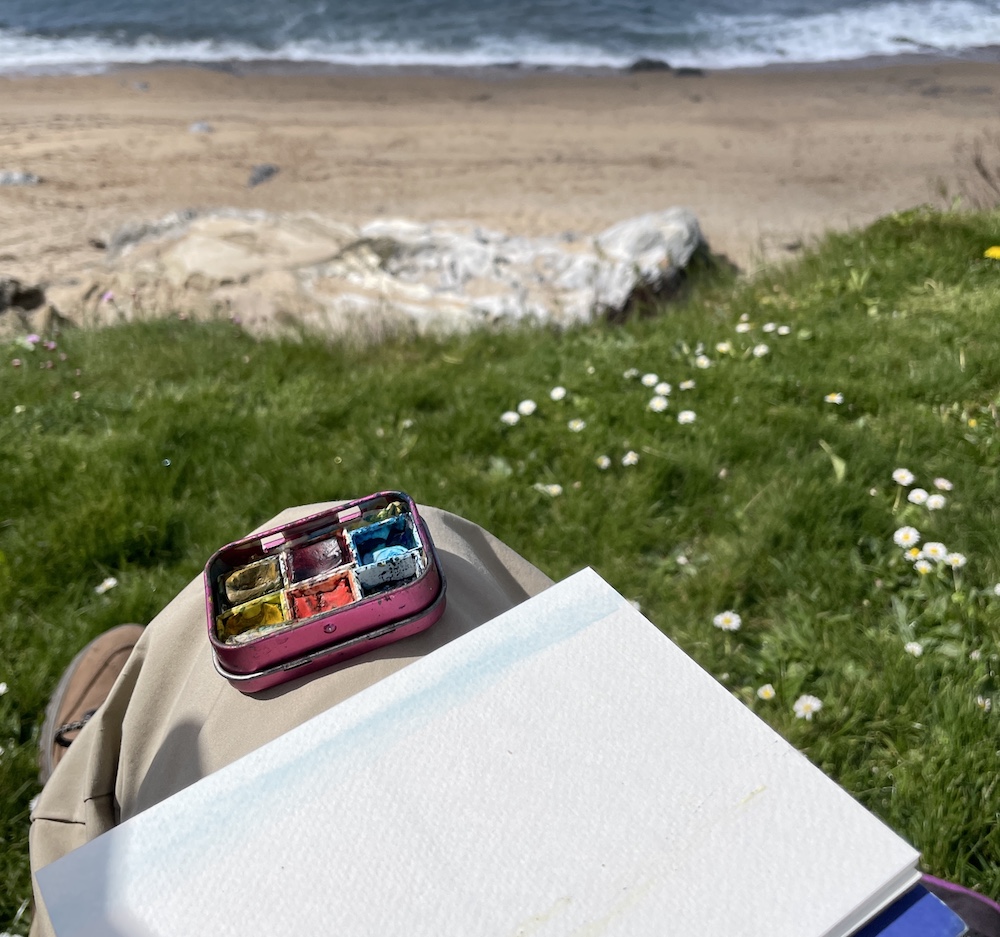
We enjoyed a lovely April which means I was able to paint some cornish coast sketches. The lovely places I visited and sketched was Hayle Estuary, Godrevy and Gunwalloe Fishing Cove.
Hayle sketch
I now have a bus pass and it was my best friends birthday so we caught the bus to Hayle and went to Gilbert’s. Gilbert’s is a lovely beach cafe at North Quay, overlooking Hayle Estuary, with Lelant Church in the background. I love this spot, especially with the added bonus of watching the trains go to and from St Ives. It was a glorious day and children were playing in the shallow water by the “lagoon” area. Hayle Estuary can be a particularly dangerous spot in the water, but the lagoon is an area that fills up with water at high tide. One of my favourite spots to swim and I couldn’t resist getting in the water after lunch.
My sketch of this part of the cornish coast shows the children playing in the water. It is definitely one of my favourites and I have already cut it up and made it into a 6 x 6 card. This will be available for sale at St Just Arts and Crafts Fair being held the first two weeks in August.
Godrevy sketch
My daughter was home so a visit to Godrevy is always a must. We had walked along the coast path, past the Seals and towards Hells Mouth. We then relaxed by the car, luckily having nabbed a front row parking spot! Ate our picnic lunch and enjoyed looking at the sea.
My sketch is looking towards Gwithian. I am not sure whether this one will end up as a card or a gift tag.
Gunwalloe Fishing Cove sketch
Another lovely walk is from Gunwalloe along the coastal path to Fishing Cove. We stopped for a while before heading up to The Halzephron Inn for a lovely lunch. I didn’t swim at Fishing Cove, because although it looked lovely it is very dangerous.
My sketch is of the surf rolling on to the sea. An abstract view, which I will probably keep for a Valentines Card 2026! I am planning ahead.
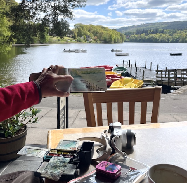
I have recently returned from a lovely holiday in Scotland, and here are my sketches from my Scotland Tour.
We were touring around and we flew to Scotland from Newquay Airport, very handy! Our tour started in Edinburgh for one night. So here is the obligatory Edinburgh Castle!
Fort William
Next stop on our tour was Fort William. We caught the train via Glasgow, the scenery from the train is great but a very slow train! Sadly the weather in Fort William was not as lovely as it was in Cornwall but still beautiful.
Click on the smaller images to see them larger and with a caption.
It was quite damp at Fort William so I sketched Loch Linnhe from our flat window.
We caught the local bus to the Glenfinnan, such a peaceful area to explore. I experimented with my sketch of Loch Shiel, painted quickly and without pen this time, as I was trying to catch the moody grey clouds.
We walked to the Viaduct, which is stunning. Whilst stood waiting for the steam train to pass over I got my paints out for a quick sketch of the viaduct. It was quite difficult stood up juggling paints, brushes and water!
Skye
From Fort William we visited Skye. We travelled via train from Fort William to Mallaig – the scenery was stunning. From Mallaig we got the ferry over to Skye, where we needed to get a taxi to Portree as there is a limited bus service. This was a mistake on my part as I thought we could get a bus! However the taxi took was great and we included a little tour of Skye and were able to stop at various view points.
We had a lovely little bunglow that overlooked Loch Portree, which was tidal and it was so relaxing to sit and watch the tide come in.
Click on any of the photos to see a larger version and caption.
We start with the view from our bungalow, across Loch Portree, with hills and mountains in the background. It was very peaceful and quite lovely .
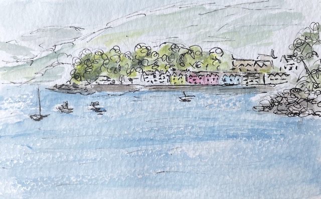
We walked the Scorrybreac trail, and whilst resting up the steep path up the hill I got my paints out. This view is looking over the fields towards a salmon fish farm, with Raasay in the background.
This time I was trying to get a different view of harbour, and its coloured buildings, set further back across the water.
We got the local bus around the Trotternish peninsula and stopped at Uig. We found the path to the Rha waterfall at Uig. Again I was standing up to paint.
Inverness
Next stop was Inverness. We caught the bus from Portree to Kyle of Lochhalsh, were we got on another scenic train. It was a damp day however the scenery passing the lochs and mountains as we slowly made our way to Inverness was lovely. We also booked a day trip to the highlands, as well as visiting Eilean Donan Castle using Rabbies Tours, which I can highly recommend.
The first sketch is of Applecross Bay. I wish I had painted the scene with a house and buildings in the background as, on reflection, I feel it needed a focal point.
Next stop the iconic Eilean Donan Castle. It was late afternoon and quite dark with the sun behind the castle and I struggled to get a lot of detail. It was also low tide so I didn’t have a lot of water for the reflection.
Our last day in Inverness was a beautiful sunny day so we walked along the River Ness and around the Ness Islands. There are pedestrian bridges to give you access to the Islands – these islands are a tranquil paradise. Another fast sketch as I try to capture a Fisherman on the River Ness.
Pitlochry
We went from Inverness to two nights in Pitlochry. This was quite a different landscape, very genteel but still with the mountains in the background. The sun shone on our two days here, which makes everything look beautiful and is a lot easier to find somewhere to sketch.
To be honest I do struggle with trees and these are not my best, especially Sketch 3, where I was trying to capture the beautiful reflections in the still water of the surrounding trees.
The first Sketch is of a canoeist on Loch Faskally, not sure I caught included enough reflections!
The boating station on Loch Faskally was a great spot to sit, have a coffee, relax and get my paints out.
Sketch 3 : Loch Faskally with mountains and trees in the background – see my comments above!
Newcastle
Last stop on our tour saw us leaving Scotland, by train on the scenic route along the Northumberland coastline to Newcastle. Just two nights and extremely different landscape! In my sketches I have tried to capture the difference of the city to the quayside with all the bridges. Newcastle certainly has beautiful architecture
Newcastle has some great seating areas and first stop was in the city centre and Grey’s Monument.
Lastly a sketch of the Tyne Bridges – this was hard but I wanted to capture the feeling of all these bridges, all with their own personality
I hope you enjoyed reading this post and seeing my sketches from my Scotland Tour, it certainly was a great holiday.
Searching for a painting of a particular location?
We use cookies on our website to give you the most relevant experience by remembering your preferences and repeat visits. By clicking “Accept All”, you consent to the use of ALL the cookies. However, you may visit "Cookie Settings" to provide a controlled consent.
This website uses cookies to improve your experience while you navigate through the website. Out of these, the cookies that are categorized as necessary are stored on your browser as they are essential for the working of basic functionalities of the website. We also use third-party cookies that help us analyze and understand how you use this website. These cookies will be stored in your browser only with your consent. You also have the option to opt-out of these cookies. But opting out of some of these cookies may affect your browsing experience.
Necessary cookies are absolutely essential for the website to function properly. These cookies ensure basic functionalities and security features of the website, anonymously.
Cookie
Duration
Description
cookielawinfo-checkbox-analytics
11 months
This cookie is set by GDPR Cookie Consent plugin. The cookie is used to store the user consent for the cookies in the category "Analytics".
cookielawinfo-checkbox-functional
11 months
The cookie is set by GDPR cookie consent to record the user consent for the cookies in the category "Functional".
cookielawinfo-checkbox-necessary
11 months
This cookie is set by GDPR Cookie Consent plugin. The cookies is used to store the user consent for the cookies in the category "Necessary".
cookielawinfo-checkbox-others
11 months
This cookie is set by GDPR Cookie Consent plugin. The cookie is used to store the user consent for the cookies in the category "Other.
cookielawinfo-checkbox-performance
11 months
This cookie is set by GDPR Cookie Consent plugin. The cookie is used to store the user consent for the cookies in the category "Performance".
viewed_cookie_policy
11 months
The cookie is set by the GDPR Cookie Consent plugin and is used to store whether or not user has consented to the use of cookies. It does not store any personal data.
Functional cookies help to perform certain functionalities like sharing the content of the website on social media platforms, collect feedbacks, and other third-party features.
Performance cookies are used to understand and analyze the key performance indexes of the website which helps in delivering a better user experience for the visitors.
Analytical cookies are used to understand how visitors interact with the website. These cookies help provide information on metrics the number of visitors, bounce rate, traffic source, etc.
Advertisement cookies are used to provide visitors with relevant ads and marketing campaigns. These cookies track visitors across websites and collect information to provide customized ads.