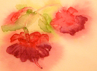
I recently enjoyed a week’s holiday in Dubrovnik, a city on the southern coast of Croatia that is renowned for its stunning coastline and rich history. I really enjoyed the challenge of sketching the beauty of this ancient city and its surroundings. Despite the heat, I managed to find some shady spots to capture the idyllic and natural landscapes. So here are my sketches of Dubrovnik, which I hope capture the essence of Dubrovnik’s natural beauty. I have included photographs to give additional context.
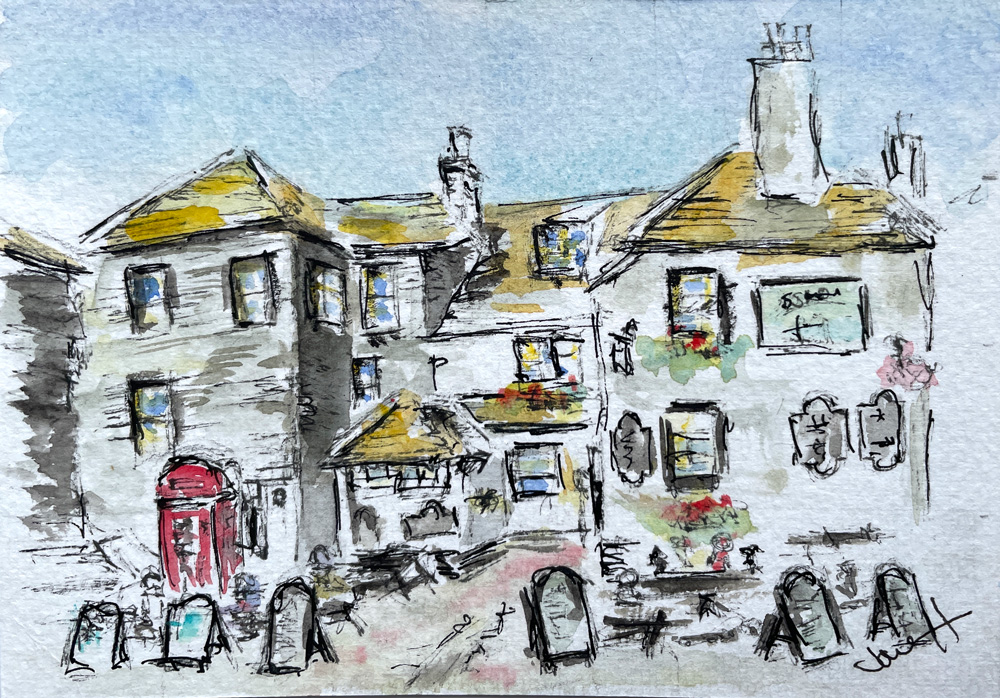
Sketch of Dubrovnik Old Town
The Old Town is just stunning, and everywhere I went, I could have sat down and got my paints out! However, the downside was partly that there was nowhere to set up my paints, it was blazing hot, but mainly I was a bit overwhelmed with all the buildings, it also felt quite vast, I just didn’t know where to start!


However, I did manage to find a shady spot and sketch one of the entrances – the Ploce Gate.
Sketches of the view from our hotel room


The view from our hotel room was absolutely stunning! The island of Kolocep and the variety of boats passing by made for a captivating and ever-changing scene. It was a wonderful experience to wake up to that view every day of our holiday. It was also a great spot to watch the sunset behind the islands every evening. I did try and capture that but it didn’t pass muster and so not included!


I loved the view so much that, on the day we were leaving, as we had a late flight, I just had to paint it one more time. This time it had a lovely blue sky.
Sketches of the hotel beach area


The hotel had its own beach area, which was also open to the public. It was a stony/pebbly beach, with large rocks on the seabed – quite different from Cornwall! However I did enjoy swimming at least once a day, although it was a steep drop into the sea. The advice encourages you to wear swim shoes, in case of sea urchins – which was useful on that pebbly beach. It was very peaceful, except when motorboats went roaring past, creating a large swell. The turquoise was was incredibly clear, I cannot use the right words to describe, but it didremind me of the waters on the Isles of Scilly.


The Hotel had a small dock area for a diving school to launch their boats from. It had the ubiquitous palm trees planted around to hide all the concrete! The photograph and the painting doesn’t correspond but hopefully you get the idea. It also had steps that some people preferred to use for getting into the water. Walking into the sea from the beach, with its steep sides, was always tricky!
Sketches from Babin Kuk to Lapad


We walked from Babin Kuk (where our Hotel was) to nearby Lapad. There is a lovely paved promenade that provides an enjoyable walk along the coastline. We stopped at the Sunset Bar Cafe that overlooked the bay and beach for a delicious coffee. Time to get the paints out, then I had to decide what scene to paint, again it was vast. Luckily there was a boat moored up in the water, so it was an obvious choice.
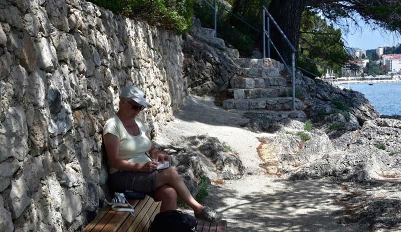
Along the promenade were small quiet areas leading off from the main path. You go down some steps to a delightful area for either sunbathing, swimming off the rocks or, in my case, sit in the shade and paint!


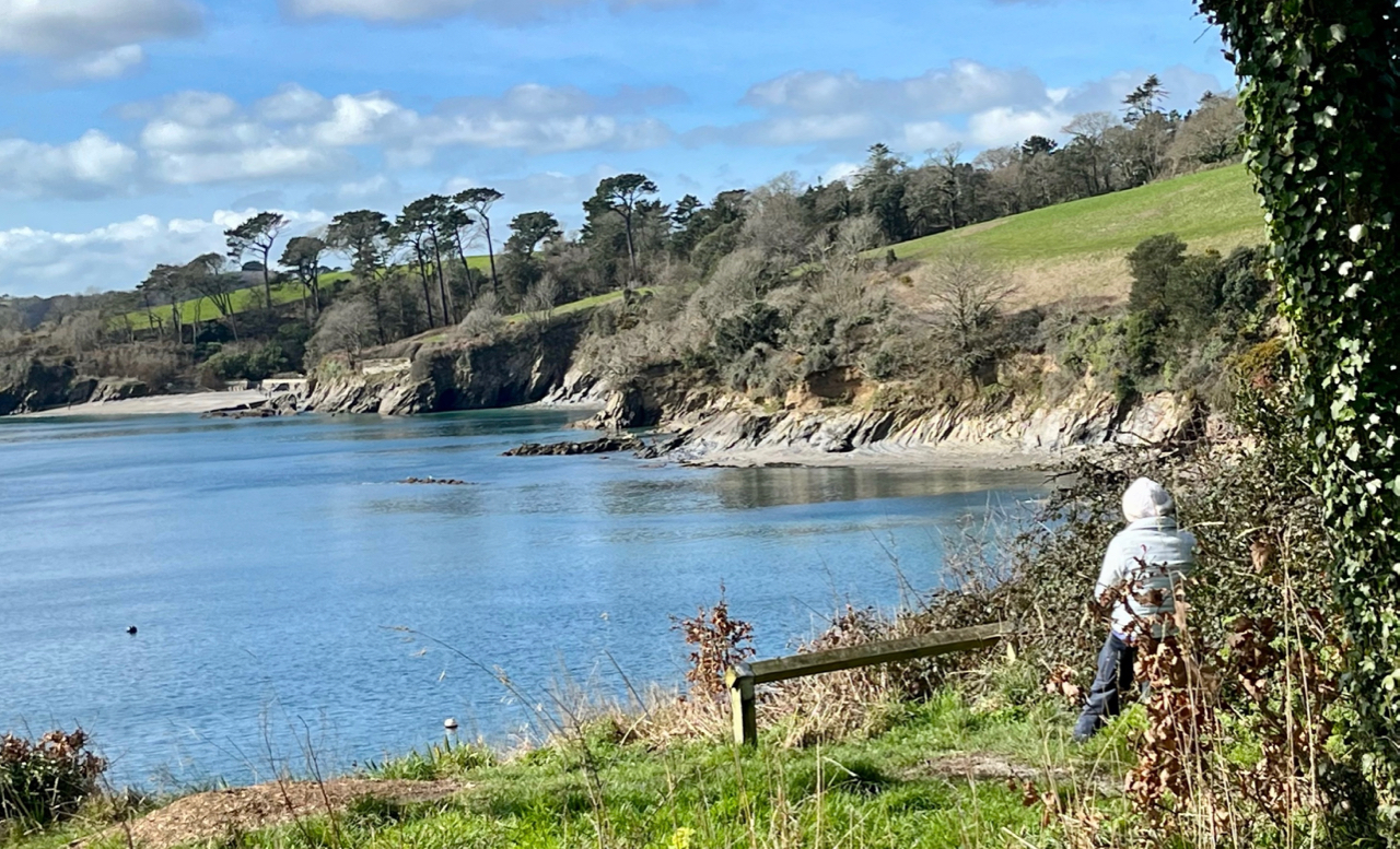
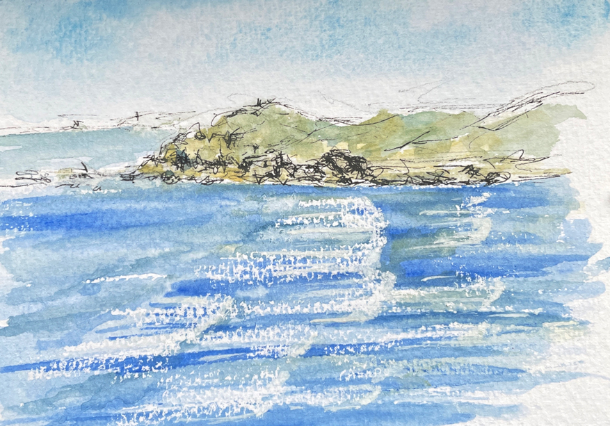
This sketch is of the Grebeni Islands and Lighthouse. I was fascinated by this rocky output and the unusually shaped lighthouse. Apparently you can stay in the lighthouse if you want accommodation with total privacy. There are tree Grebeni Islands – Zapadni, Srednji and Juzni Greben (meaning West, Middle and South Greben) situated one next to another, with a reef called Jabuka.


The Grebeni Islands and Lighthouse fascinated me. Our Hotel had a different view of them, where you can see the turquoise sea. So I just had to paint it again, trying to get a closer view of the Hotel, whilst also trying to show the shimmering colour of the sea.
Sketches from Babin Kuk to Gruz Harbour


Daksa Island, which overlooks the Hotel President beach, has a rather dark history. It is the smallest island in the Elaphite archipelago, where there was a massacre of collaborators when Partisans liberated Dubrovnik at the end of 1944. It is an island that no-one visits and it is certainly is the antithesis from everyone enjoying the sunshine and beach.


The main port of Dubrovnik – Gruz was close to Babin Kuk, where we our Hotel was situated. Again there was a promenade, this time more natural. It passed several beaches, including the Coral Beach Club and Copacabana Beach, with other small beaches appearing as you turn a corner. There was even a special beach just for dogs – Plaza Za Pse. I really liked the Beach bar Ponat – a bar set amongst the forest, it had a real relaxed vibe overlooking the waters. Another pretty spot was the Ronilački klub Dubrovnik, another diving area – however on our first walk it started to spit with rain, so the paints didn’t come out.


On another day I walked back to sketch the area with all the boats but someone was sitting on a bench that had the view I wanted to sketch. So I went around the corner, where there is an amazing view of Dr. Franjo Tuđman Bridge. I decided to have a go at capturing this scene instead.
I had a great holiday and I hope you have enjoyed looking at these sketches, and also some insights into my holiday in Dubrovnik.